|
By vlepore - Friday, October 8, 2010
|
In all versions of GenoPro 2007 all objects are opaque. In version 2.5.2.3, you can choose whether to show the objects opaque or transparent.
However, if you open with version 2.5.2.3 a genogram acquired with GenoPro 2007, all objects appear transparent.
You can set all objects as opaque by default, when you open a genogram, which provided only opaque objects?
Thanks.
|
|
By GenoProSupport - Friday, October 8, 2010
|
|
I noticed the same when I did a genogram, the text outline was too small. Can you try GenoPro 2.5.2.4 and tell me if you see the text better. I have increased the width of text outline.
|
|
By vlepore - Saturday, October 9, 2010
|
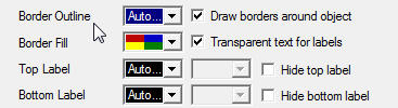
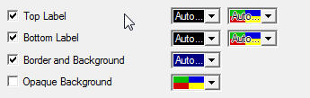
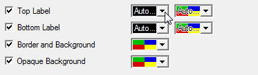
It seems to me that the version Gamma should import the files acquired with the Beta version, by setting:
1) top label color “auto”
2) bottom label color “auto”
3) (yes) Opaque Background
Just so you get a good compatibility.
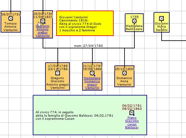
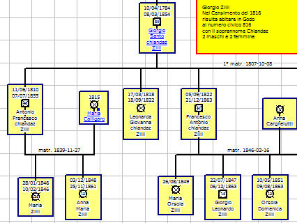
Here are two examples (vertical two different parts of the same file):
The file is acquired with version 2.0.1.6. with these settings (the settings are valid for all individuals in the genomap) :
 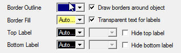
This is the view with the same version:
(Multicolor in 2.0.1.6) (Monocolor in 2.0.1.6)
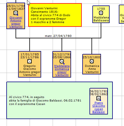 
Viewing the same file with Version 2.5.2.4: (With the default settings:)
(Multicolor in 2.5.2.4) (Monocolor in 2.5.2.4)
This is the view:
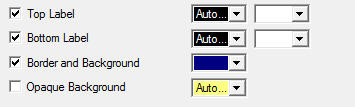
Viewing with Version 2.5.2.4, making objects opaque and “top label” “auto..” , and “bottom label” “auto..”, with color “auto:
 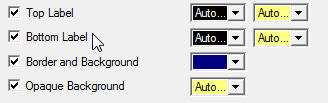
This is the view:
( So the view is similar to the version 2.0.1.6)
I hope this suggestion will be useful for everyone, not just for me.
|
|
|
|
|
By genome - Tuesday, October 12, 2010
|
I also think that display compatibility is very important when opening a .gno from 2.0.1.6 with 2.5.2.x. The change to transparent background for Individuals can drastically alter the look of a genogram.
The is also another issue due to the fact that text in the labels is now outlined instead of having a background colour. When no background box is set for the individual then the resulting display looks somewhat untidy due to the ragged edges produced by the outline e.g. 2.5.2.4 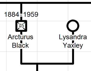 2.0.1.6 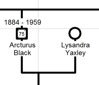 Notice also the 'smudge' between the 7 and 5 in the age of Arcturus due to outline not covering that part of the deceased cross. In my opinion te 2.0.1.6 version is cleaner visually. Outlined text only looks ok if the outline colour is different to the background colour. So PLEASE can we retain the option for text background as well as text outline. Perhaps have an 'outline text?' checkbox in the properties dialog against top and bottom label color selections.
|
|
By jcmorin - Tuesday, October 12, 2010
|
|
Text outline have been a try and been put mostly everywhere but as you point it out, some place make it worst that it was before. We will make sure the final version have a visible better or same as before, if not it will be as option.
|
|
By tdebuys - Monday, October 18, 2010
|
I have been using GenoPro for several years and find it an awesome tool.
My family tree has about 4500 individuals and and many worksheets (based on Surname) with hyperlinks between them.
I would like to try out the new version, can you please tell me how I can download it or how I can get onto the beta list?
thanks
|
|
By maru-san - Monday, October 18, 2010
|
You can find the link to download the new version(not the final one) in this post
http://support.genopro.com/Topic26643.aspx#bm26698
|
|
By GenoProSupport - Tuesday, October 26, 2010
|
Ron (10/12/2010)
I also think that display compatibility is very important when opening a .gno from 2.0.1.6 with 2.5.2.x. The change to transparent background for Individuals can drastically alter the look of a genogram. The is also another issue due to the fact that text in the labels is now outlined instead of having a background colour. When no background box is set for the individual then the resulting display looks somewhat untidy due to the ragged edges produced by the outline e.g. 2.5.2.4 2.0.1.6 Notice also the 'smudge' between the 7 and 5 in the age of Arcturus due to outline not covering that part of the deceased cross. In my opinion te 2.0.1.6 version is cleaner visually. Outlined text only looks ok if the outline colour is different to the background colour. So PLEASE can we retain the option for text background as well as text outline. Perhaps have an 'outline text?' checkbox in the properties dialog against top and bottom label color selections. I modified the code to better draw the text outline depending on the content of the square or circle. I added a checkbox "outline text" however at the last moment removed it because I beleive the changes I made will do it. Can you please try the latest http://www.genopro.com/monica/ and let me know if it is correct.
|
|
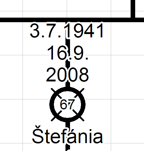
By powery - Tuesday, October 26, 2010
|
Hello,
I just installed version 2.5.2.5
the 'smudge' is still present between 6 and 7.
When you choose Display - Date of Birth and Date of Deaths (on separate lines), the separation is not between date of birth and date of death but in the date of birth or date of death.
See this picture.
|
|
By Barry Graham - Wednesday, October 27, 2010
|
If the text from Version 2007 is going to appear with blits and jagged edges like the example in the post above I'll be sticking with 2007.
I prepare my Genograms like the second of Ron's examples (2.0.1.6).
They are clear and readable when inserted into a publication - unlike the outlined text example above.
Please preserve the opaque background with no background box as an option.
-----------------------
Barry Graham
Melbourne, Australia
|
|
By genome - Friday, October 29, 2010
|
GenoProSupport (10/26/2010)
I modified the code to better draw the text outline depending on the content of the square or circle. I added a checkbox "outline text" however at the last moment removed it because I beleive the changes I made will do it. Can you please try the latest http://www.genopro.com/monica/ and let me know if it is correct.
Unfortunately I can see very little improvement with version 2.5.2.5. The outline of the age in the gender symbol is maybe slightly improved, but for example if you change 'Arcturus Black' size to extra large you get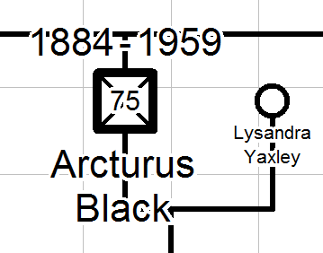 which I think illustrates some of the issues with outlined text when no border background is present. I believe the best solution would be to retain the 2.0.1.6 text background color as an option. Also this version has not addressed the issue of transparent background to the border of gender symbols. I agree with vlepore's suggestion that when importing an earlier .gno then backgrounds should be set to be opaque to maintain compatibility.
|
|
By Jakk - Tuesday, March 26, 2013
|
|
I just noticed this change in the new version, having been away from my projects for a few weeks due to work and other commitments, and I have to second the request to bring back the opaque borderless text option. In fact, it should be the default setting, because having the parental line visible by default just interferes with the display of the name. My 2 cents, anyway.
|