|
|
|
|
Customers
GenoPro version: 2.5.4.1
Last Login: Sunday, August 25, 2024
Posts: 20,
Visits: 39
|
would like to list all entries by name - showing DoB And date of burial in a chart - in order to see which memebers were alive at the same time.
This could be done on a spread sheet , but would need all deatails entering which are already contained on Geno Pro
|
|
|
|
|
Customers
Important Contributors
FamilyTrees.GenoPro.com
GenoPro version: 3.1.0.1
Last Login: Yesterday @ 12:58 PM
Posts: 1,608,
Visits: 33,499
|
Not sure what you are trying to get. The Genopro data is in effect a spreadsheet and can be sorted by clicking a column head. Right click on the screen to see copy options. Is that the sort of thing you are looking for?
|
|
|
|
|
Customers
GenoPro version: 2.5.4.1
Last Login: Sunday, August 25, 2024
Posts: 20,
Visits: 39
|
On paper ! I have the names in one colum (top to bottom) and from left to rightalong the top- years , the year of birth in the year column ,and in the following cols. I have their year of death.
What I should like to be able to see - over a period of time which people were alive, and might have been known each other..
Obviously if I have the years along the top in cols there could be hundreds, so i made the cols for every 10 years - its still alot of cols.
I was looking to just incorparate my current entries into this sort of chart ,and not have to make another.
is this too complicated ?
thank you for your interest
|
|
|
|
|
Administrators
Customers
Important Contributors
FamilyTrees.GenoPro.com
GenoPro version: 3.1.0.1
Last Login: 3 hours ago
Posts: 3,495,
Visits: 27,358
|
Well it's a cold winter's evening here and nothing much on TV so I thought I'd take a look.
Looking at the types of charts available in spreadsheets I thought a 'candlestick' chart would fit this task. They are normally used to display movement on stocks and shares, showing opening and closing prices together with high and low values. The plot normally has a candlestick shape with a wick and a tail, but if we collapse the 'candle' we are left with just a wick and tail. Dob is used for low value and DoD for high value. I calculate the mid-point between birth and death and use this for the candlestick open and close points, and as they are the same value the 'candle' is collapsed to a single point. This is what I ended up with: 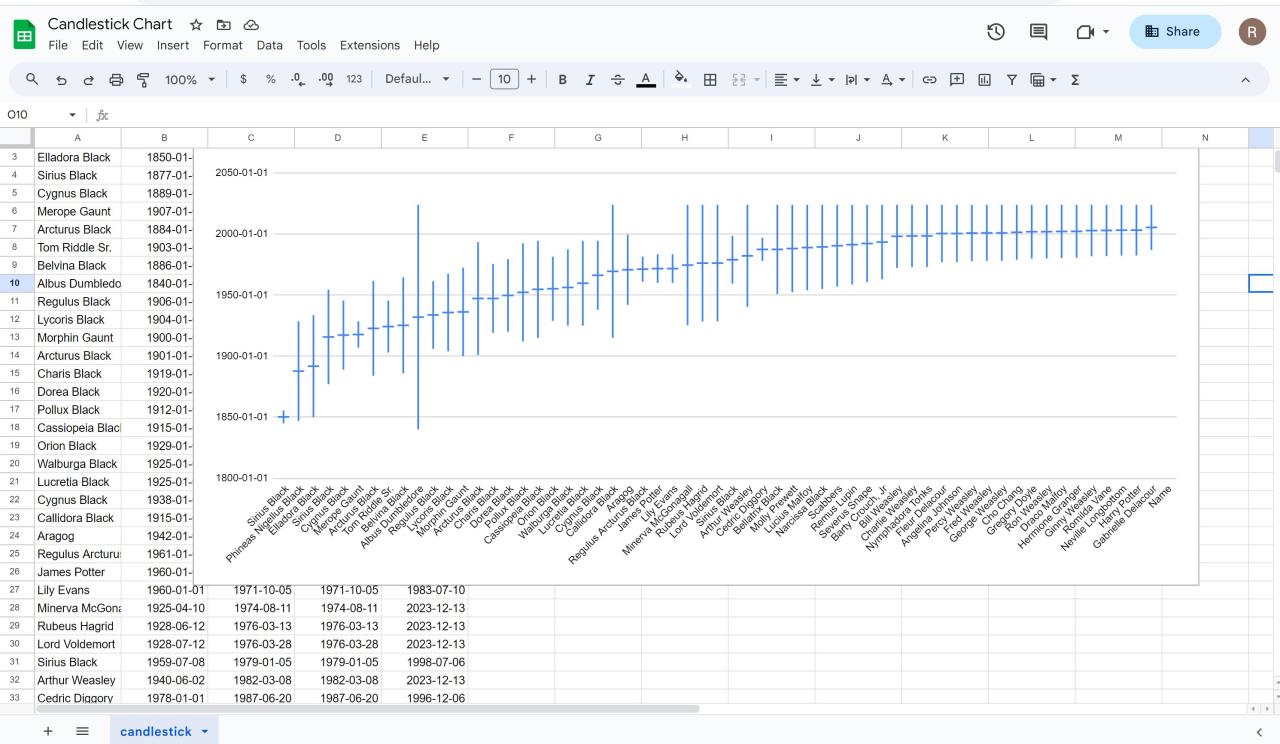 I have written a ' Report Skin Template' to extract the required data from GenoPro. This is attached to this post and should be unzipped into your GenoPro Report Skins folder along side the other skins. Running this report will generate a .csv file that can be uploaded into say Google Sheets. Having loaded the data select first column C, then select the whole sheet and and then click Data, Sort, Sort on Column C. Then click Insert and then Chart. Click chart type on the right and scroll down to the candlestick chart towards bottom right. A fair bit of 'jiggery-pokery' was required to coerce the data into the right format. If a date only has a year then 1st Jan is assumed for birth and 31st Dec for death. For living individuals the 'death' date is set to today's date so that they can be shown on the report.
'lego audio video erro ergo disco' or "I read, I listen, I watch, I make mistakes, therefore I learn"
 Candlestick Chart Data.zip
(102 views,
1.08 KB)
Candlestick Chart Data.zip
(102 views,
1.08 KB)
|
|
|
|
|
Customers
GenoPro version: 2.5.4.1
Last Login: Sunday, August 25, 2024
Posts: 20,
Visits: 39
|
Thank you for your efforts. Looks impressive - I am not sure how it works though.
Say I had - as I do, Col.William Massey 1600-1668.
one of 5 sons = George Massey 1632-1666
his sons William Massey 1649- 1692
Charles Massey 1665-1737
Richard Massey 1666-1747
So it seems that Col William Massey is alive after his own sons death , and alive for some of his grandchildrens lives.
So if i selcted the year 1664 I could see who was alive then, and may be even in contact .
(this is the period of the English civil war so lots of movemnet of people).
Is that too complicated,? please bear in mind i have very basic omputer knowledge...I can do it on a roll of wallpaper but----
thanks for taking the time to think about it.
juno
|